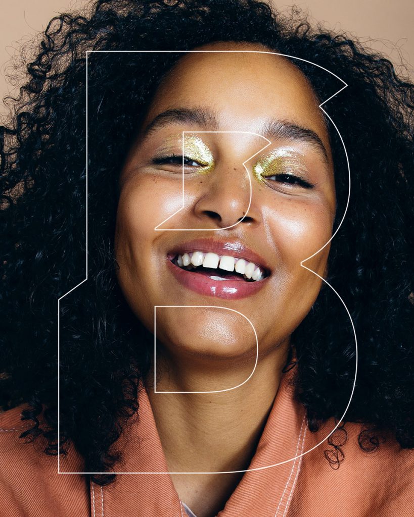
 One of Europe’s largest independent online beauty destination Beauty Bay has had a makeover, centred around a new powerful proposition of Break The Rules. And through the process they have thrown out the cosmetic marketing rulebook to develop a creative attitude that matches their brave challenger brand position.
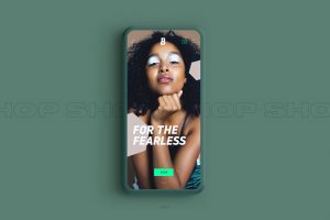
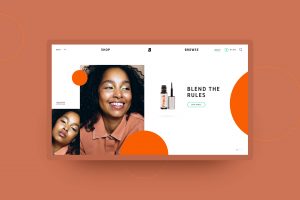
The brand’s striking new identity has now been rolled out across all of its consumer touchpoints – from website to social media channels – and is already proving a huge hit with its digitally empowered target audience of 16-25 year olds.
The new logo, brand identity, proposition and digital strategy has been created by digital-first design agency MERó in partnership with the Beauty Bay in-house team and its head of creative George Burton.
 Andy Culbert, MERo’s founder who led the agency’s work explains how the project came about: “Beauty Bay was born in 1999 – the same year as many of its current core customers. But things were very different then. The entire world wasn’t digital!
“Beauty Bay originated as an online business selling fragrances – and the brand reflected this. Over the years, the business and the brand evolved but to truly resonate with its core audience who live their lives digitally it needed an overhaul.
 “The starting point was to throw away any preconceived ideas of Beauty Bay’s audience and to create a definitive view of the actual target audience’s current online behaviours, influences and expectations – as they are today (with one eye also on what they might be in the coming years).
“This involved “Live the Brand Workshops’, social listening and lots of market research – not just within the cosmetics sector but in the main fast-fashion world. The insight was mixed in with Beauty Bay’s own internal culture – already defined as ‘ambitious and creative boundary pushers’. The process also heavily involved buy in from all areas of the organisation to not only manage the development of a brave new look and feel, but to engender the necessary shift to a digital-first culture.
 The research revealed that who the brand had historically identified as its core audience was actually younger than the business thought. The customer journey was also explored in much more detail, and core influences on their purchasing decisions.
The original brief became obsolete (which meant Beauty Bay and MERó working in partnership to rewrite the brief) and from this in-depth insight came the decision to throw out any preconceived ideas of what a beauty brand should be, pushing boundaries within the sector, yet with a firm focus on the consumer. A unifying yet flexible vision for the future became the new brief.
 Underlying keywords running through the development process included: Beauty Bay is Fast. Pioneering. Different. Disruptive and a multitude of creative avenues were explored. Through a variety of testing processes the successful route – a brave, fearless brand identity that challenges conventions and aims to redefine the idea of what beauty is – was rolled out across Beauty Bay’s consumer touchpoints using Agile methodologies. The new brand was first unveiled in Spring and now appears across the majority of forms and spaces of the business.
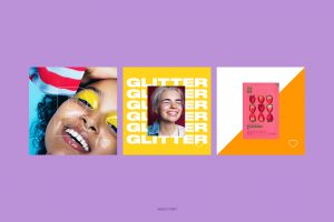
“We have created a brand with the flexibility to adapt to the fluidity of the beauty sector and the digital landscape”, says MERó’s Andy Culbert. “We achieved this by taking a completely digital-first approach, designing for how Beauty Bay customers are engaging with them – from Instagram and YouTube to Pinterest and Twitter. It offers a mix of fixed and flexible brand design to mirror today’s constantly changing world and allow them to react to seasonal trends and palettes.
 “Beauty Bay needed a strong identity to stand out against the many brands it stocks. It now has a consistent look and language in every channel, and from the smallest spaces to the largest. The website then continues the journey – to make purchasing as easy and enjoyable as possible. Even the choice of typeface was selected with a digital-first approach and continued testing throughout the development process showed how effective even the smallest of design elements were going to be as part of the user experience. ”
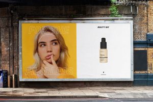 Andy added, “Most importantly they have a visual style and personality that truly sets them apart and that lives up to their brand essence: ‘We don’t play by the rules, we break them’. It has delivered a re-brand has future-proofed the business.”
“As a business heavily influenced by trends, where success is often determined by a fast response to what customers want to buy, a constant influx of ‘hot’ new products and fresh influencers, the brand is now flexible enough to respond to this.
 “Digital-first focused brand guidelines direct the evolution of the brand, with a core logo that works across every application. There is a full design language that the Beauty Bay teams can now apply with confidence.
“There is also a flexible colour palette, updated quarterly, that can be applied in line with the changing seasons – from summer festival season to warm autumn shades – and that is reflective of new trends.
Andy concluded: “Similarly, the tone of voice has been designed to better suit the dominant communication channels and routes to market. And while the tone of voice has some fixed elements our guidelines support ways in which is can be flexed to suit each medium. Beauty Bay can compete with everyone else in the sector and beyond. The brand’s strong values and messaging shine through its photography and videos as well as core digital presence.”
Source: MERó

You must be logged in to post a comment Login