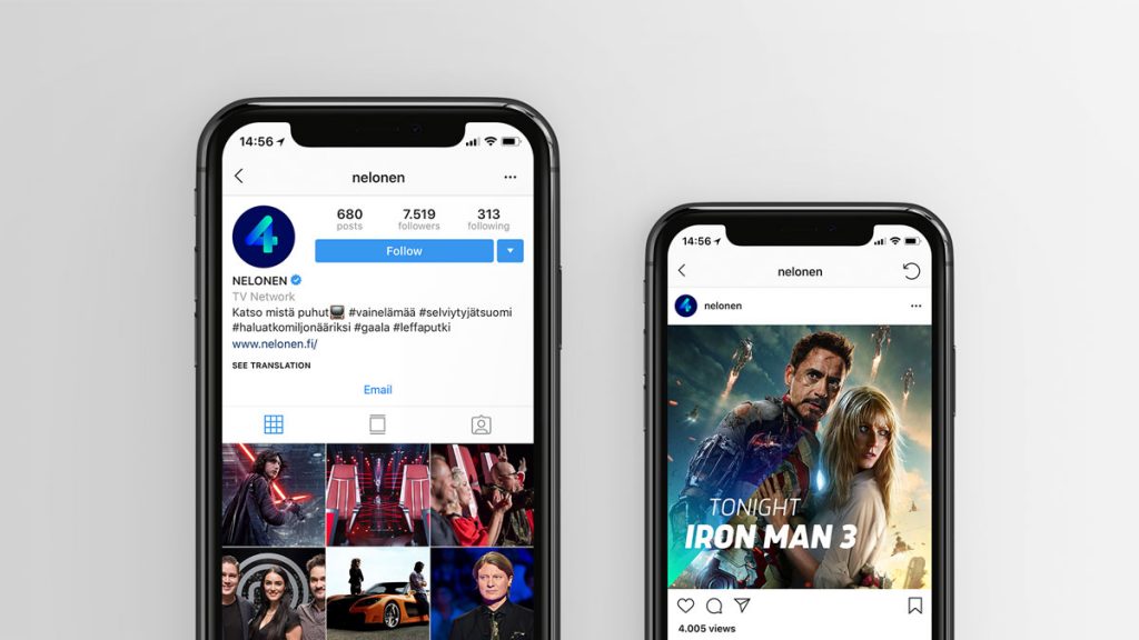
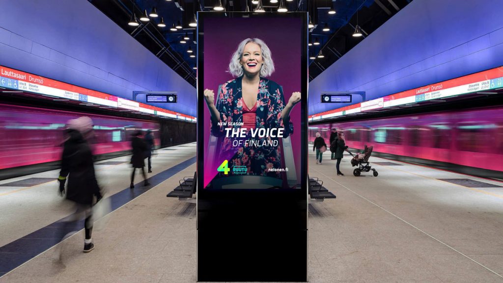
Creative agency CapeRock has created a modern illuminating identity to change the perception of Nelonen across Finland.
 The new brand identity is based upon the concept of “The Magic of Big Entertainment” and is inspired by the Northern Lights. The rebrand aims to transform Nelonen from a commercial broadcaster to that of the largest media entertainment brand across Finland.
The re-design includes a new logo and visual identity system, on air package, idents, sound design, print and digital. The new visual identity has a magical, vibrant and enchanting feel, as various colourways and gradients are used throughout the visual package and ident treatment.
 It is driven by a clean and confident graphic language that is complemented by strong and emotive imagery. The idents were shot in various unique locations in and around Helsinki and reveal the wonder and mystery surrounding Nelonen and everything it touches.
“The new design of Nelonen has a fresh and contemporary look. It includes some subtle nods towards our VOD service Ruutu, as the brands now appear and work in unison. The graphical identity is based on the notion of light and its glow; some might see spotlights, or maybe something else, but the warmth of the glow is almost a tangible element,” says Heini Häyrinen, Senior Vice President Marketing at Nelonen.


Source: CapeRock

You must be logged in to post a comment Login