[KGVID width=”600″ height=”338″]https://marcommnews.com/wp-content/uploads/2016/02/New_look_for_Premier_League_from_2016_17-474457592.mp4[/KGVID]
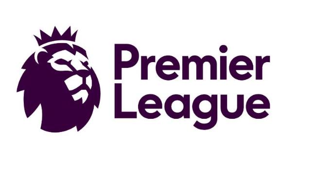
February 9 saw the launch of a new visual identity for the Premier League, which will be used from Season 2016/17 onwards.
Working in partnership with global agency DesignStudio and Robin Brand Consultants the League has created an identity that includes a modern take on the lion icon – a symbol that is part of the competition’s heritage – which is flexible in digital and broadcast formats.
 “We are very pleased with the outcome: a visual identity which is relevant, modern and flexible that will help us celebrate everyone that makes the Premier League,” commented Premier League Managing Director, Richard Masters.
DesignStudio Founder and CEO, Paul Stafford, said that the release was just the start with a lot more to come from the Premier League before the new season begins.
“Our aim was to create an identity that acknowledges everyone who plays a part in one of the most exciting leagues in the world,” Stafford said. “And with a fresh, new take on the iconic Lion, we’ve created an identity that’s purpose-built for the demands of the modern world. While staying true to the Premier League’s history and heritage.”
 For the first time in its 23-year history, the Premier League will operate without a corporate sponsor and it is looking at how best to maximise a “clean” brand.
But just how good is the new identity? Here are a few reviews from four leading personalities in the design industry:
 Simon Preece, Director of Effectiveness Stuff at Elmwood:
“In my opinion the new Premier League identity provides a nice simple minimal approach that cuts through the aggressive macho world of sports identities. It is single minded and by elevating the use of the Lion’s head to form the focal point of the identity, the identity confidently conveys pride, passion and prestige.
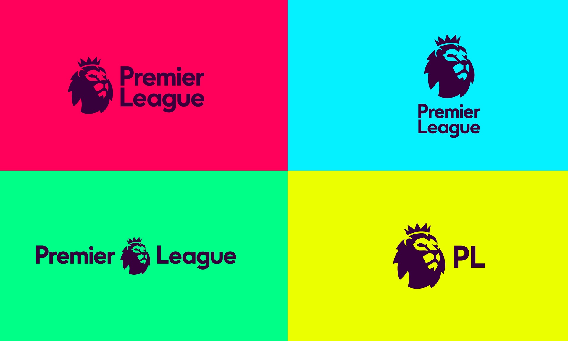
“The use of the Lion’s head also creates a clear point of visual orientation for the viewer, reducing unnecessary visual clutter. It works well when the head is left aligned to the type, or used centrally, as the image and type are visually balanced. That said, it does struggle in the portrait stacked version, as the sharp cusp shapes in the crown and face draw the viewers eye upwards and away from the logo type.
“I love the use of calm space enabling the brand to ooze confidence to proudly proclaim its presence and stand out from the crowd. It is a brand that will work effectively in the mobile and digital arenas. In this case less is definitely more and it will increase the desirability and usability in merchandising, adding value to any associated future sponsor. Nice job.â€
 Bulletproof London Creative Director, Tony Connor:
“The League’s decision to drop sponsorship has led to a slightly less corporate feel and has been replaced by a new direction that feels a bit more tech than a sporting brand. The digital/broadcast first thinking has obviously influenced this greatly… the approach, “make it work as an app icon, and worry about everything else after†is very evident in the application so far.
“Yes the lion icon works well – it’s simple and confident with a subtle link to football with its rounded form. Where it all comes unstuck for me, is the typography and application in the sporting context. The application on the sleeve and ball is pretty awful. The type set on a semicircle feels unbalanced and awkward, plus it’s illegible from any distance.
I’ll be interested to see where the development of the bespoke font ‘Premier sans’ lands, as it feels like the typography currently lacks distinctiveness. Overall, I applaud the ambition and simplicity; the colours are an interesting departure and bring energy to the system, but ultimately, I feel like we may have lost a bit of emotion and relevance along the way.”
 Jon Davies, Co-Founder & Creative Director, ButterflyCannon:
“I think it’s a great move on for the brand. Focusing on the key icon of the lion is enough for the brand’s recognition and of course signifies its status, the ball was unnecessary as all football fans know what the the Premier League is.
Keeping it clean, simple and iconic will allow for it to work across multiple platforms, essential for any identity in today’s world.”
Derek Johnston, Co Founder and Strategy Partner, Family (and friends):
 “I know little about football, only that the Premier League is undergoing a degree of reform, so the time seems right for a refresh. The visual identity is strong and modern, something akin to a TV Chanel ID, perhaps with that very use in mind for the future?
It’s comes across as a more populist sports brand now, like the big soccer brands of Nike and Adidas – less like a British institution, which I see as a good thing. Graphically it looks like a stencil – maybe inspired by Banksy? (if not the Lion King!)
From what I’ve seen of the applications so far, it works very well. Will look good on the kits. Good job.”
So a mixed bag – but generally a positive reaction from the experts, which echoes the reaction the Premier League is getting from its fan on twitter:
It looks like the logo from an energy drink. Premier League – now in Strawberry flavour! https://t.co/UPcH7g7c3x
— Andy Parsons (@andypars) February 9, 2016
Overwhelmingly excited to see the Premier League’s new logo. I mean, look at his face, just look at his face. pic.twitter.com/utkMVahyi9
— Gary Lineker (@GaryLineker) February 9, 2016
You’ve got to love the new PL logo. A fitting tribute to one of the great movie characters of all time. #RIPmufasa pic.twitter.com/K29WIisLLY
— Paddy Power (@paddypower) February 9, 2016
The New Premier League logo is alright, but they should have kept the old typeface. #PremierLeagueLogo pic.twitter.com/KvOPLur5nR
— Ben Nipper (@Ben_Nipper) February 9, 2016
@SamuelPetyt @MarkPrecept @AdamPrecept I think I’m sold! It’s pretty ballsy, clean, current and most likely a grower. #PremierLeagueLogo
— Nick Johnson (@NickPrecept) February 9, 2016
Just how good is the Premier League’s new visual identity? added by newsroom on
View all posts by newsroom →
You must be logged in to post a comment Login