 “Mobile advertising as a whole is just fairly crappy,” said Sebastian Tomich, The New York Times senior VP of advertising and innovation.
Mr. Tomich isn’t saying anything controversial. Most people seem to agree that those thin horizontal banners pinned to the bottom of publishers’ mobile sites haven’t won many fans. Neither have the full-screen interstitial ads that can overtake a smartphone’s screen while swiping between articles on many publishers’ mobile sites, including the Times’. So the Times is doing away with them.
“We’re retiring at some point late this summer — maybe early fall when we can run the last one that’s already been sold — we’re retiring mobile interstitials. We’re trying to move to a place where the less desirable mobile ad units, where we actually free our experience of them,” said New York Times Chief Revenue Officer Meredith Levien.
In place of the interruptive mobile ads, the Times is adopting a mobile ad format that’s akin to Facebook’s and Twitter’s in-feed mobile ads.
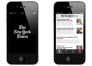 The New York Times plans to roll out a new ad format in September to its smartphone apps and mobile site in the U.S. that mimics the in-feed placement of the social networks’ mobile ads and applies the publisher’s editorial insight to how they’ll be targeted and what multimedia bells and whistles they’ll feature.
Called Mobile Moments, the ads will be customized to the seven moments in a given day that are most important to readers, as identified through a 12-month study conducted by the Times’ editorial product team. Those moments include the beginning of the morning — which accounts for 25% of the Times’ mobile traffic, per Mr. Tomich — lunchtime and the end of the day.
The publisher’s advertising team “had a full seat at the table from the moment we started doing this research,” said Alexandra Hardiman, the Times’ VP of mobile products. That meant that as the Times editorial team came up with ways to capitalize on these mobile moments by doing things like introducing morning and evening briefings, its advertising team was able to draft its own ideas and bounce them back and forth with the editorial team so that when the mobile moments ads begin to roll out next month, they won’t stick out any more than they need to, though they will be clearly labeled as advertisements.
 For example, the early-morning ads will be largely text-based to align with the Times’ morning briefing, which is a text-heavy roundup of the day’s news and events. Conversely the evening version of these mobile moments ads will feature photos and videos to complement the Times’ evening briefing, which is a similar news roundup to the morning briefing but typically includes a dozen or more photos to make the reading experience more entertaining.
These mobile moment ads are designed to not be as interruptive as the mobile interstitials, but that doesn’t mean they won’t be as attention-grabbing. Appearing within the mobile apps’ and site’s article feeds, the ads will take up the entire width of the screen like each article entry does, but they’ll also take up 75% of the screen vertically. By taking up three-quarters of the screen, the ads follow the Times’ plan to reduce the number of ads it runs to make sure those that do appear have a chance to be seen. But because the articles above and below the ad peek out just enough, The New York Times hopes the new ads won’t feel as claustrophobic or coercive of people’s attentions.
 Advertisers will be able to buy these ads according to which of the seven dayparts they would like to target. At launch, The Time plans to limit the ads to one advertiser per daypart, and is selling the ads as an impression-based sponsorship with a certain number of ad impressions guaranteed, Mr. Tomich said, though he declined to specify terms.
“We’re very much tailoring creative to the moment of the day,” Mr. Tomich said. The Times’ 40-person branded-content arm T Brand Studio will create these mobile moment ads, which will focus “primarily on short-form content” that are being referred to as “Screenplays,” he said. However, brands will also have the option of using their own creative content. Using the hypothetical of an energy brand, he said that the Times could come up with an image that would represent someone’s walk to work and throughout the day the Times’ advertising team would update the ad’s copy to go along with whatever of the moment of the day it is.
“This is, in our eyes, actually native advertising. It doesn’t have to be long-form branded content or sponsored stories. We’re essentially here just sharing the same tools our newsroom uses to promote their content in an ad unit,” Mr. Tomich said.
So-called “native” advertising — which spans advertorials and in-feed ads designed to look like editorial placements — and mobile have been growing areas of focus for The New York Times, as the company looks to grow its digital ad revenue. Last year The New York Times made $182.2 million from digital advertising — a 12% increase year-over-year — with less than 10% of that money coming from the Times’ advertorial product Paid Posts. However, “we still make more of our money on the desktop obviously,” but these new ads are a way to potentially boost mobile’s contribution.
 “It’s the first ad product we’ve put out where we’re really trying to model the ad product around how we’re modeling how our newsroom thinks about their own stories on the mobile device,” said Ms. Levien.
She is referring to the Times editorial product team’s move in the second quarter of this year to revamp the look of article entries in its mobile apps and on its mobile site. In place of “an almost standardized RSS list” that displayed an article’s headline, one- or two-line description and a thumbnail image, the Times adopted the cards format originally introduced in its NYT Now mobile app that could enlarge photos to cover the full width of the screen and include non-standard content like videos, according to Ms. Hardiman.
“As soon as we came up with the new flow from a card perspective was when we realized it made sense to think about advertising as well,” Ms. Hardiman said. She added, “by applying the same techniques to advertising content, we put advertising and edit on a similar playing field.” By that she means that some of the first mobile moment ad options will included embedded slideshows and videos that play inline, which are formats already used for the Times’ editorial content.
“It’s going to take some time to get there, but we’d like to be in a position where all of the atomic units of advertising are relatively similar to, if not the same as, the atomic units of editorial content,” Ms. Levien said.

You must be logged in to post a comment Login