 Most brands and businesses are trying to cope with the challenges caused by a digital world that never stands still, none more so than the fashion and beauty industries.
A packed calendar of events across the globe sees brands constantly unveiling new looks for style-conscious consumers to apply to their clothing, hair and make-up. Add to this the rise of the ‘influencer’, be it a celebrity, blogger or Instagrammer, inspiring trends and colours of the season and the instant demands of today’s digitalised consumer – being reactive as a brand or retailer has never been so important. And that means having an adaptable brand as well as responsive marketing campaign.
Forward-thinking businesses are now using digital brand guidelines that enable their brand identity to flex with seasonal updates and in line with trends. In turn allowing brands to tap into constantly changing digital spaces.
By its very nature digital branding needs to be flexible. Since the introduction of mobile, responsive websites and social channels, the days of a logo being a specific size or being anchored to a set position are long gone. But the new wave of ‘trend led’ digital branding is pushing this flexibility even further in a bid to resonate with changing customer bases.
 It’s a way to keep a brand identity ‘current’. As trends change, brand identities (particularly those operating in the fast fashion and beauty sectors) can soon look dated. Keeping up with a constantly changing demographic – that alters their rules of engagement with brands almost daily – can create sizeable challenges for designers.
For decades, brands have been created with a set of static guidelines delivered at a point in time and often left unaltered for years. Of course, brands need a strong identity, and brand guidelines to ensure they deliver a consistent look and feel across all consumer touchpoints, but businesses also need to stay relevant to their audience.
The process of developing and releasing new campaigns according to seasonal trends is a fundamental business process, but when working within a ‘traditional’ design process (following a fixed set of guidelines not created for a digital world) brand colours and fonts can sometimes jar with the look and feel a brand is trying to achieve. This can result in the finished design (and therefore the brand experience as a whole) feeling disjointed.
The solution is to create a flexible identity system, and have a set of guidelines where certain elements of the design stay constant – usually the core logo, brand positioning, typography, iconography, – and others are dynamic.
 Campaign and lifestyle imagery and colour palettes are examples of design elements that can be updated as new trends emerge. When working within the perimeters of a flexible identity system, this can all happen without the need to entirely review the brand guidelines and whilst staying controlled and consistent.
It’s a process can actually lead to a more unified brand experience for the end user. But it will only be a success if a strong and characterful brand is defined through the fixed design elements. Establishing a memorable identity that knows what it is and what it stands for (and more importantly the audience also knows and recognises) allows the scope for other elements to flex.
For some organisations it may not be appropriate for branding to be too flexible. Banks and hospitals for example need clear, consistent messaging to provide authority and reassurance. Yet even within these sectors there are opportunities to flex according to who uses the services. Children wards for example could be made more welcoming and friendly if a different typeface was used. Similarly, young start-ups might appreciate a different tone of voice within the banking sector.
Fashion brands are different, they’re constantly pushing boundaries and looking for ways to stand out. An audience of fashion-conscious consumers born into a digital age of immediacy are quick to abandon brands that don’t keep up.
 The root of success for key players in the fashion industry is to take a digital-first approach that allows brands to be quick to react and appeal to new audiences. And by doing this, they’re also future proofing their brands.
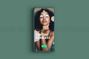
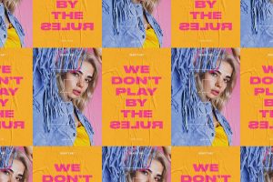
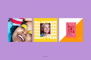
Rebranding Europe’s largest independent online beauty retailer Beauty Bay (a firm favourite with the UK’s 16-25 year olds) is an example of how we at MERó implemented a full digital-first re-brand – incorporating a fixed and flexible system that works across every application.
There are also seasonal guidelines that Beauty Bay’s teams can apply with confidence. The colour palette, updated quarterly, can be applied in line with the changing seasons – from summer festival season to warm autumn shades. It’s also designed to be adaptive to trend forecasting.
The brand’s tone of voice has been created to better suit the dominant communication channels and routes to market. And while the tone of voice has some fixed elements, the guidelines support ways in which is can be flexed to suit each medium.
As a business heavily influenced by trends, the latest products and fresh influencers – where success is determined by a fast response – Beauty Bay now has a brand that’s able to respond to this.
 Article by Andy Culbert, co-founder of digital-first branding agency MERó.
About Andy:
With 20 years of digital design experience, Andy has a deep understanding of the constantly changing digital landscape. Having worked with global brands such as the BBC, Reebok and Lexus, he co-founded MERó in order to help organisations perform better in digital spaces by prioritising online communication channels.
Source: MERó

You must be logged in to post a comment Login