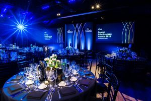
 The DBA Design Effectiveness Awards revealed their various winners during a grand ceremony held on February 22, at The Brewery in London. The programme recognises projects which demonstrate design’s tangible effect on business, from increased gross margin to job creation.
The awards were presented by Rt Hon Matt Hancock MP, Secretary of State for Digital, Culture, Media and Sport, and recognise work that demonstrate design’s tangible effect on a business by drawing focus onto design’s strategic and commercial value.
Here are some of the winners from the 2018 edition of the DBA Design Effectiveness Awards:
Taxi Studio
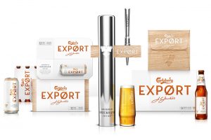 Bristol based design house Taxi Studio took home the Grand Prix at the DBA Design Effectiveness Awards, for their brand redesign for Carlsberg Export.
Carlsberg was having an identity crisis. Millennials knew the beer for its humorous advertising but little else and gross profits had been declining for four years.
With a shrinking lager market and a rise in discerning drinkers searching for premium alternatives, Carlsberg was losing its position at the bar and on the shelf. Something needed to be done to reinvigorate the brand – to win back the hearts and minds of drinkers, retailers and Carlsberg’s own people.
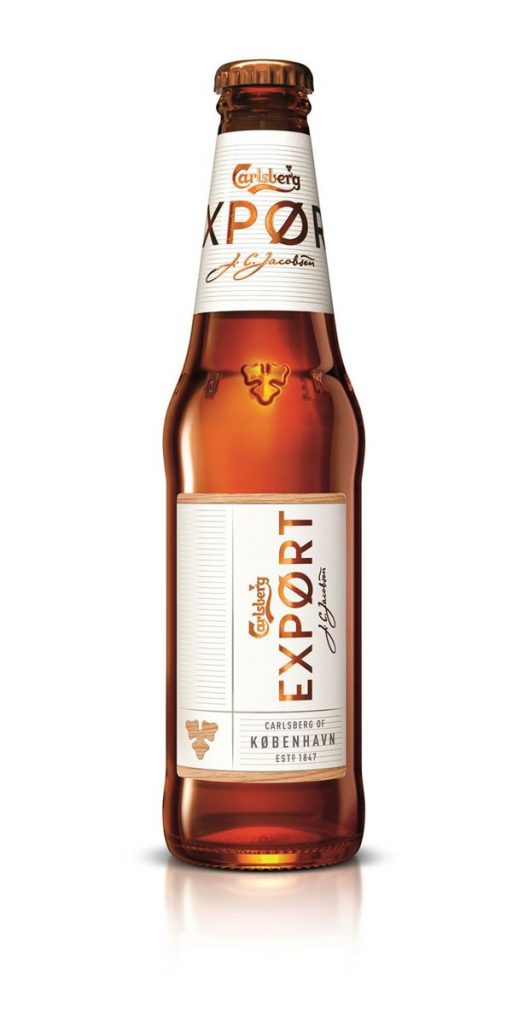 With a new proposition and a Scandinavian inspired design that oozed style and focussed on the brand’s Danish roots, Carlsberg Export gained a premium, contemporary feel, which transformed its outlook.
Before the new visual identity, Export had 3,240 distribution points in Grocery customers – this jumped to over 9,000, a 170% increase. It even gained a place on Sainsbury’s shelves having been delisted for five years. These big wins, including being relisted in Waitrose, have helped not only stabilise gross profit, they have since grown by 2% on every Hectolitre sold and a wider halo effect is being felt by the Carlsberg brand.
And all of this happened before any other supporting comms aired and within a remarkably short period of time – only 14 weeks after relaunch.
“We’re absolutely over the moon to have won the DBA Gold and Grand Prix Awards. Delivering commercial success is at the heart of everything we do, which is why this is such a huge deal. After picking up seven awards in various competitions over the last year, this double win is the crowning moment for a hugely successful project and a perfect example of how courage and collaboration delivers great success,” said Spencer Buck, Founder and Creative Director at Taxi Studio.
Elmwood
Elmwood, the Leeds-based global brand design consultancy, celebrated a further 5 DBA Design Effectiveness Award wins at the 2018 ceremony. This brings the total of DBA awards for Elmwood to 67, making it the world’s most effective brand design agency for the ninth year running.
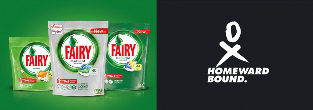
Elmwood was awarded 2 gold, 1 silver and 2 bronze trophies together with its clients Procter & Gamble, Homeward Bound, London Beer Lab, Day One and Mars, Incorporated. The winning projects were:
- P&G Fairy – Gold – P&G’s Fairy increased in value by 5.7%, primarily driven by consumers trading up and a 4.2% improvement in the price mix. It won in the ‘design driving growth in global business’ category.
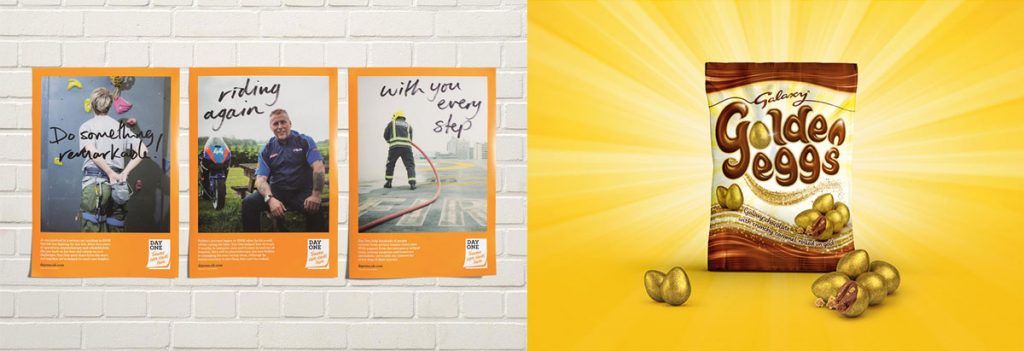
- Homeward Bound – Gold – Homeward Bound achieved the most press coverage for women in science, ever, with zero media spend. It won in the ‘design proving its power to persuade’ category.
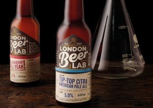 London Beer Lab – Silver – London Beer Lab has grown its customer base to the point of scaling up production from an obscure nano-brewery level to that of a steadily growing microbrewery. It was awarded in the ‘design that is good for business is also good for government’ category.
- Day One – Bronze – Day One has garnered widespread press coverage and raised over £500k to invest in life-changing equipment. It was recognised in the ‘design as the fast growth imperative for start-ups’ category.
- Mars’ Golden Eggs – Bronze – After just two years, Mars’ Golden Eggs became the fastest growing item in the small sharing category, with 74% of growth coming from incremental sales. It was awarded in the ‘design as the critical enabler for competitive advantage’ category.
Jonathan Sands OBE, Elmwood owner and vexillifer: “To have won yet another 5 DBA Effectiveness Awards in our 40th anniversary year, is a tremendous honour and achievement for the Elmwood team and our clients. To be topping the DBA league table for the 9th year running is phenomenal and something we are incredibly proud of. Fundamentally, we believe that effective design marries meaningfulness with memorability to create truly iconic brands that work in an omni-channel world. And we believe in clients that have the vision to work with us to create some extraordinary design work. My thanks go to my team and to our clients.”
Deborah Dawton, Chief Executive of the Design Business Association, said: “Design uniquely cuts to the heart of every business it touches. It closes the gap between business risk and market success. So when it comes to our nation’s competitiveness, infusing design universally into business should be a priority in order to drive long-term growth and economic advantage for the UK. The DBA Design Effectiveness Award winners prove why.”
B&B studio
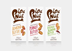
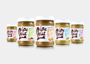 B&B studio was awarded gold at the DBA Design Effectiveness Awards for its role as strategic and creative partner for Pip & Nut, the successful nut butter brand launched by leading entrepreneur Pippa Murray.
Shaun Bowen, Creative Partner, B&B studio says: “We’ve been working with Pippa as strategic and creative partners for more than three years now since the initial brand creation, and it’s great to see the remarkable achievements of Pip & Nut recognised with a DBA Design Effectiveness Award. Now a trusted lifestyle brand, Pip & Nut has reinvented nut butter as a healthy snack and been instrumental in challenging category norms. Our focus on the health benefits and depth of flavour in the strategic positioning of the brand, alongside instantly recognisable visual assets, has enabled Pip & Nut to achieve sustained over-performance year on year.”
 Pippa Murray, Founder, Pip & Nut says: “From day one, B&B studio understood our ethos that healthy food doesn’t have to be boring and captured this in a playful identity that speaks to a wide range of consumers. As brand guardians, they’ve steered Pip & Nut through expansion of the product range and enabled us to experience explosive growth whilst staying true to our core values.”
Since B&B studio was appointed by Pip & Nut in 2014 the brand has achieved extraordinary growth, exceeding Year 1 turnover targets by 233% and achieving cumulative Year 1 to Year 3 sales growth of 950%. Pip & Nut is now available in approximately 4,000 stores from Sainsbury’s to Selfridges, with an international launch plan currently underway.
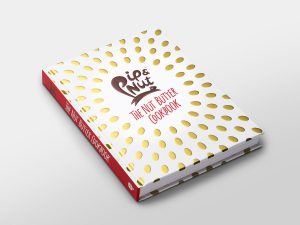
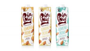 Pip & Nut launched in January 2015 with a range of all-natural nut butters including Peanut Butter, Almond Butter and Coconut Almond Butter, available in jars and handy on-the-go squeeze packs for a tasty snack. The brand currently sells eight nut butter flavours, a range of dairy-free almond milks and a cookbook with healthy recipes.
Working collaboratively with Pippa Murray, B&B studio introduced an energetic brand identity with playful language and unfussy type, challenging the more traditional aesthetics of competing brands in the nut-based product category.
 With a focus on powerful flavours and the use of only pure and natural ingredients, Pip & Nut has established itself as a leading lifestyle brand for health-conscious consumers seeking to avoid palm oil and dairy.
A leaping squirrel whose tail forms the ‘P’ in Pip & Nut embodies the characterful spirit and broad appeal of the product range. Witty messaging and a fresh look and feel communicates the simplicity of the nut butters whilst retaining the playful brand personality. B&B studio created the brand positioning, brand identity, packaging design and website for Pip & Nut.
Denomination
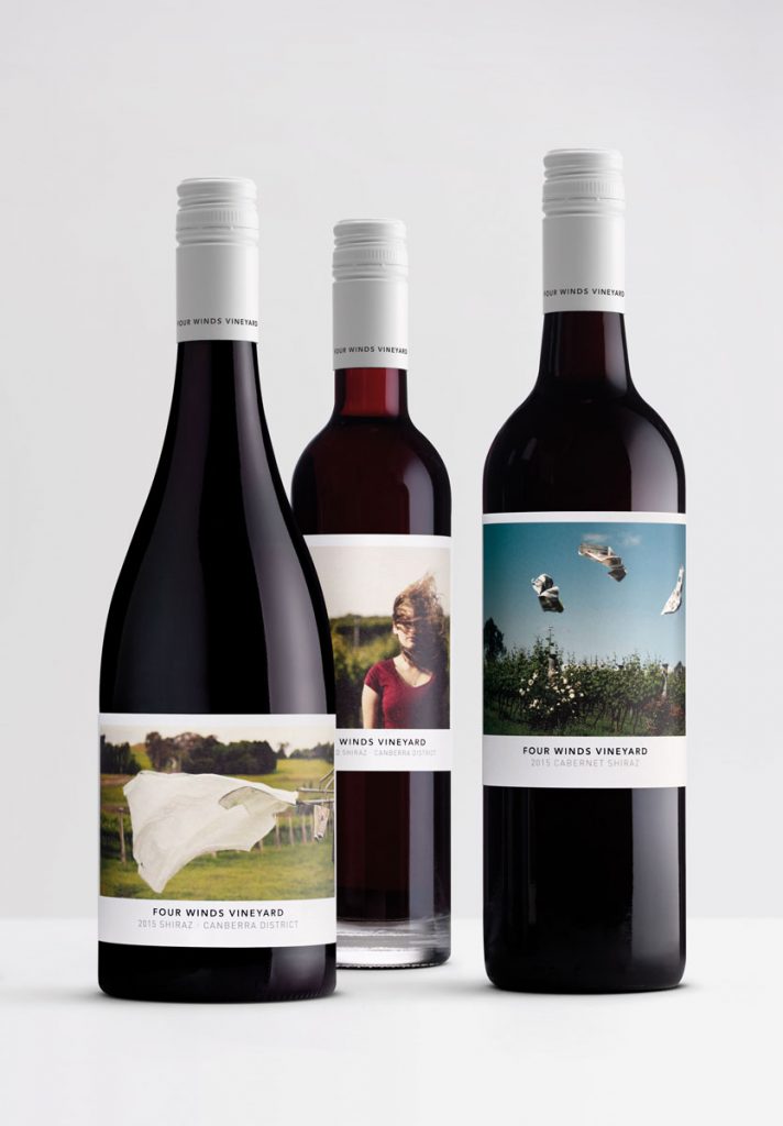
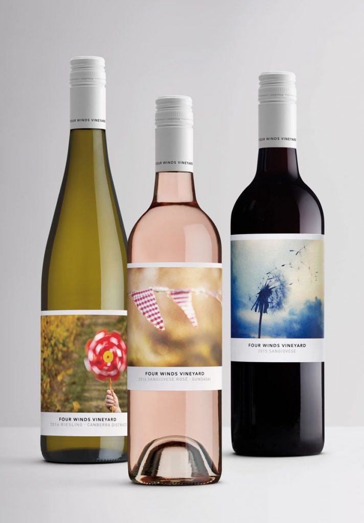 Four Winds Vineyard, a small family-owned winery just outside Canberra, Australia, tasked Denomination with redesigning its branding and packaging to boost the chances of securing a distributor for the competitive Sydney market.
For small wineries trying to compete against bigger well-funded players, the label is their only voice and because the majority of consumers pick a wine based on the label, design is crucial.
The redesign achieved the brief’s objective to secure a Sydney distributor and 18 months later, the winery experienced significant growth and a greater profile within the industry and with consumers.
Wholesale listings rose by 246 per cent, cellar door visitors increased by 245 per cent and wine production was boosted by 170 per cent. In addition, the business was able to take on 11 new members of staff.
Margaret Nolan, Global Creative Director, Denomination, says: “Winning Gold at the DBAs for our work on Four Winds Vineyard will be a wonderful boost for the team who worked so hard on this. It’s been a joy to watch Four Winds Vineyard take off following the redesign. It’s been especially pleasing to see owner, Sarah named the Australian Women in Wine Awards 2017 Owner/Operator of the Year and to be chosen as a 2017 Future Leader by the Australian Wine Industry.”
 Sarah Collingwood, Business Manager, Four Winds Vineyard, says: “We have been overwhelmed by the response to the new label design. The business has been able to list its wines with a high profile on premise distributor which was a key objective of the project. The success of the vineyard following our work with Denomination really illustrates the power of design.”
Four Winds Vineyard packaging needed to better reflect the ethos and personality of both the family and the winery. Denomination found feedback from visitors to the cellar door was overwhelmingly positive about the down to earth, friendly and authentic nature of the winery. It observed that the business’s Instagram account, showing evocative photographs of daily life on the vineyard, embodied the essence of the brand.
So, Denomination asked Collingwood to capture windy days on the vineyard, with each wine featuring a different windswept scene, bringing the brand name to life. Digital printing reduced the cost and an upgraded paper stock gave the label a more premium and tactile feel. The brand identity was also updated to a more recognisable and contemporary icon whilst still retaining the spiral of the original logo.
Nolan adds: “The resulting images were delightful, with a low-key charm which perfectly expressed the small boutique family nature of the vineyard. They are also designed to appeal to the adventurous wine connoisseurs we are targeting.”
Source: DBA Design Effectiveness Awards
Agencies celebrate DBA Design Effectiveness Awards success added by newsroom on
View all posts by newsroom →
You must be logged in to post a comment Login